GREEN EDITS
Working with the founders I led the visual strategy and brand identity development for Green Edits. The brand aims to help people make eco-conscious swaps to everyday household and lifestyle products. By developing a clear identity and visual toolkit, the founders were enabled to build a following and partner with other brands to advocate for environmentally conscious products.
Role / Creative/Design Director & Illustrator
Client / Green Edits
Founders / Courtney Smith & Julie Lawrence

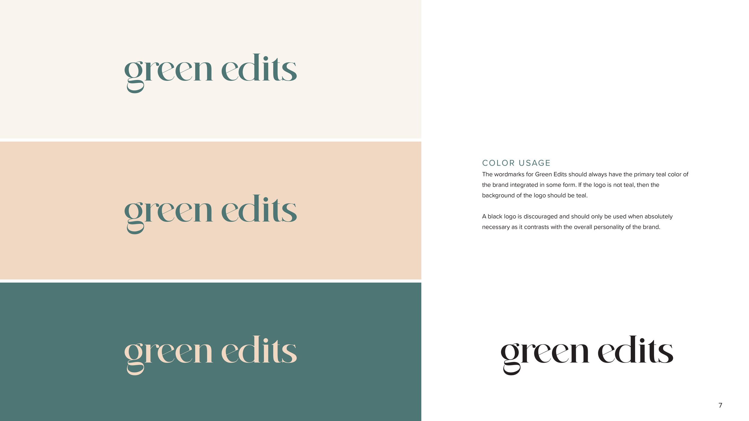
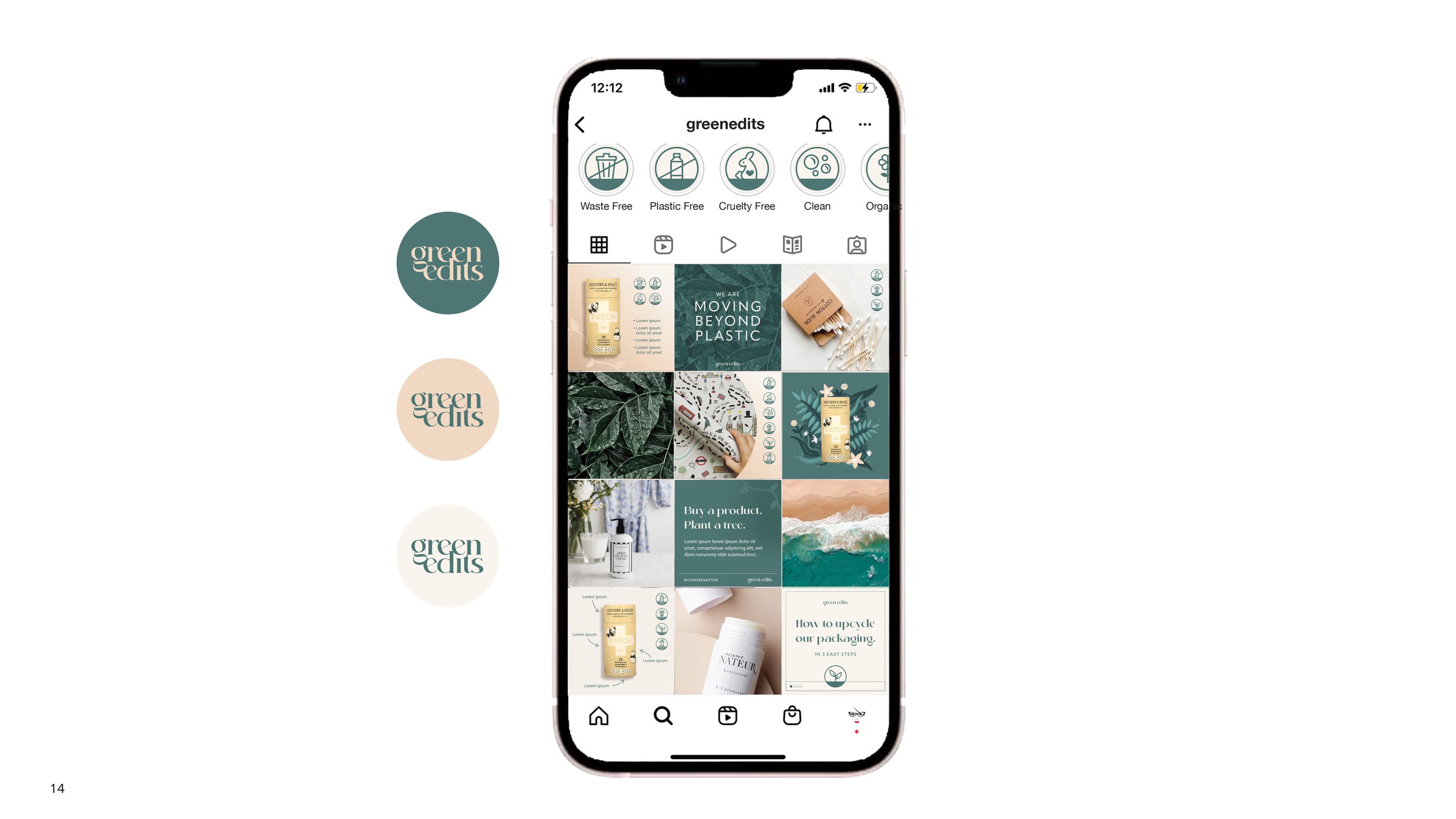
LOGO DESIGN /

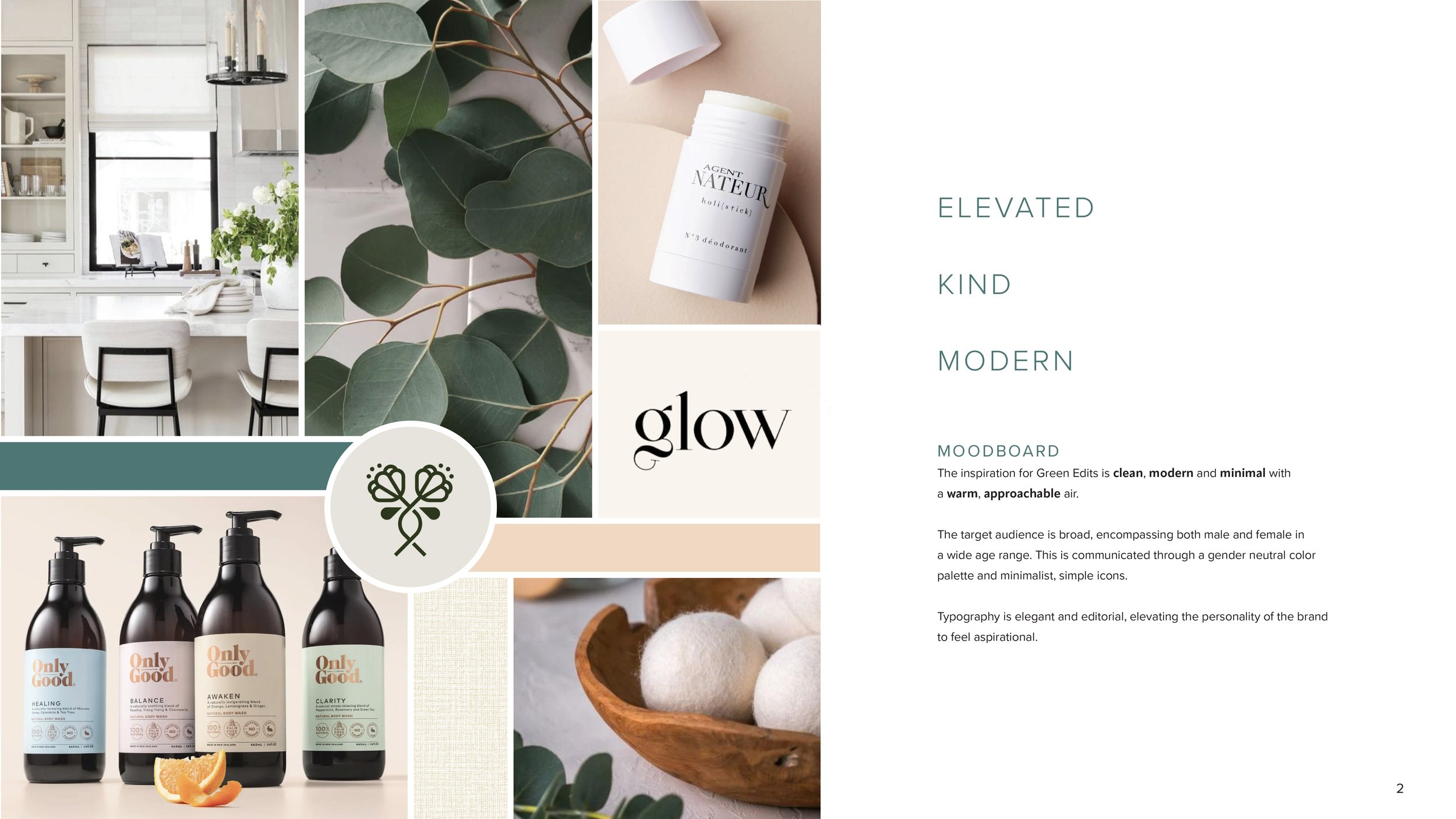
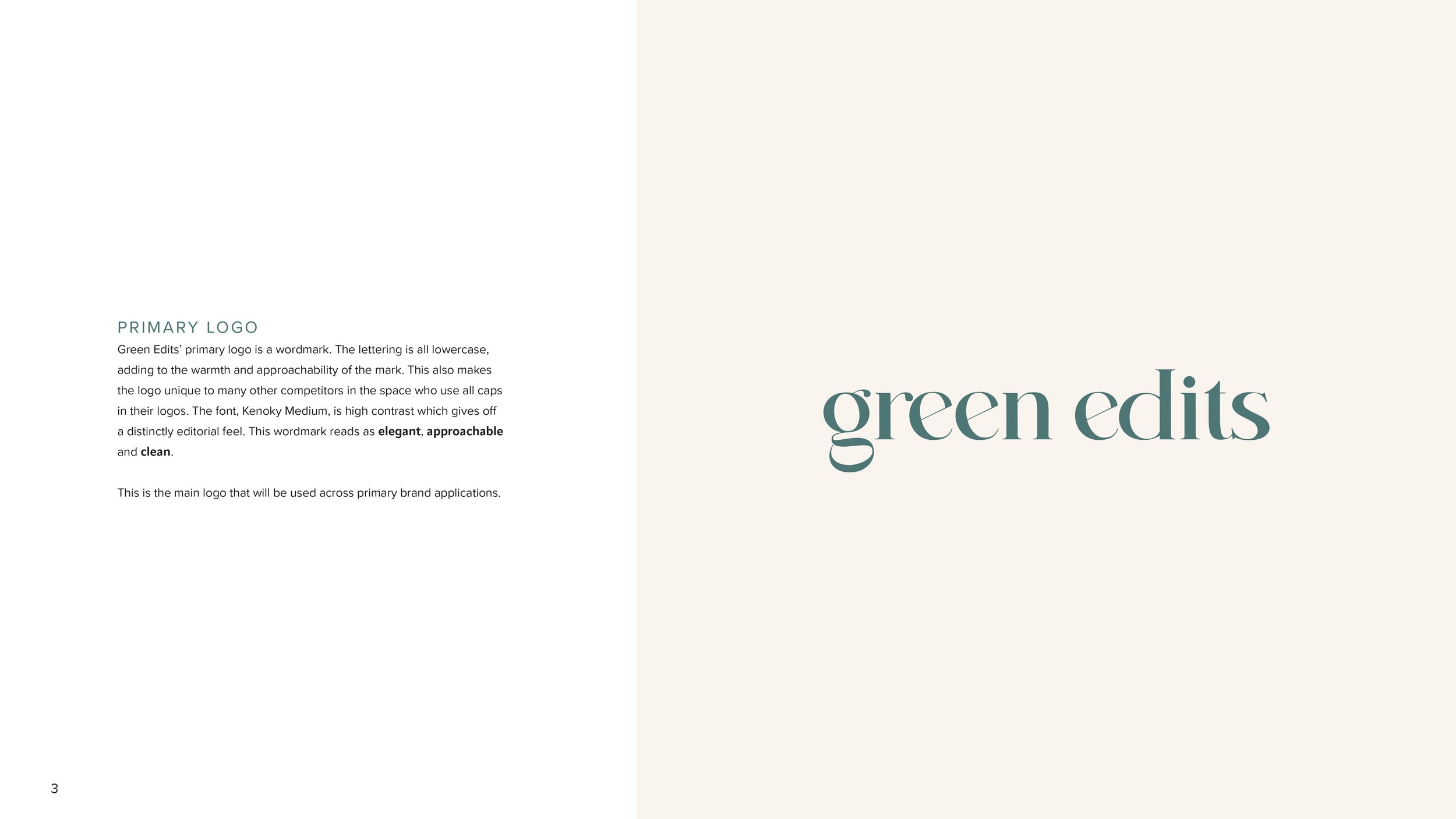
I wanted the logo design to stand out from the competition and feel approachable and light. Other brands in this space have logos that are overly strict (all caps and sans serif) and I felt it was essential to depart from that style to give the brand an authentic and original quality.
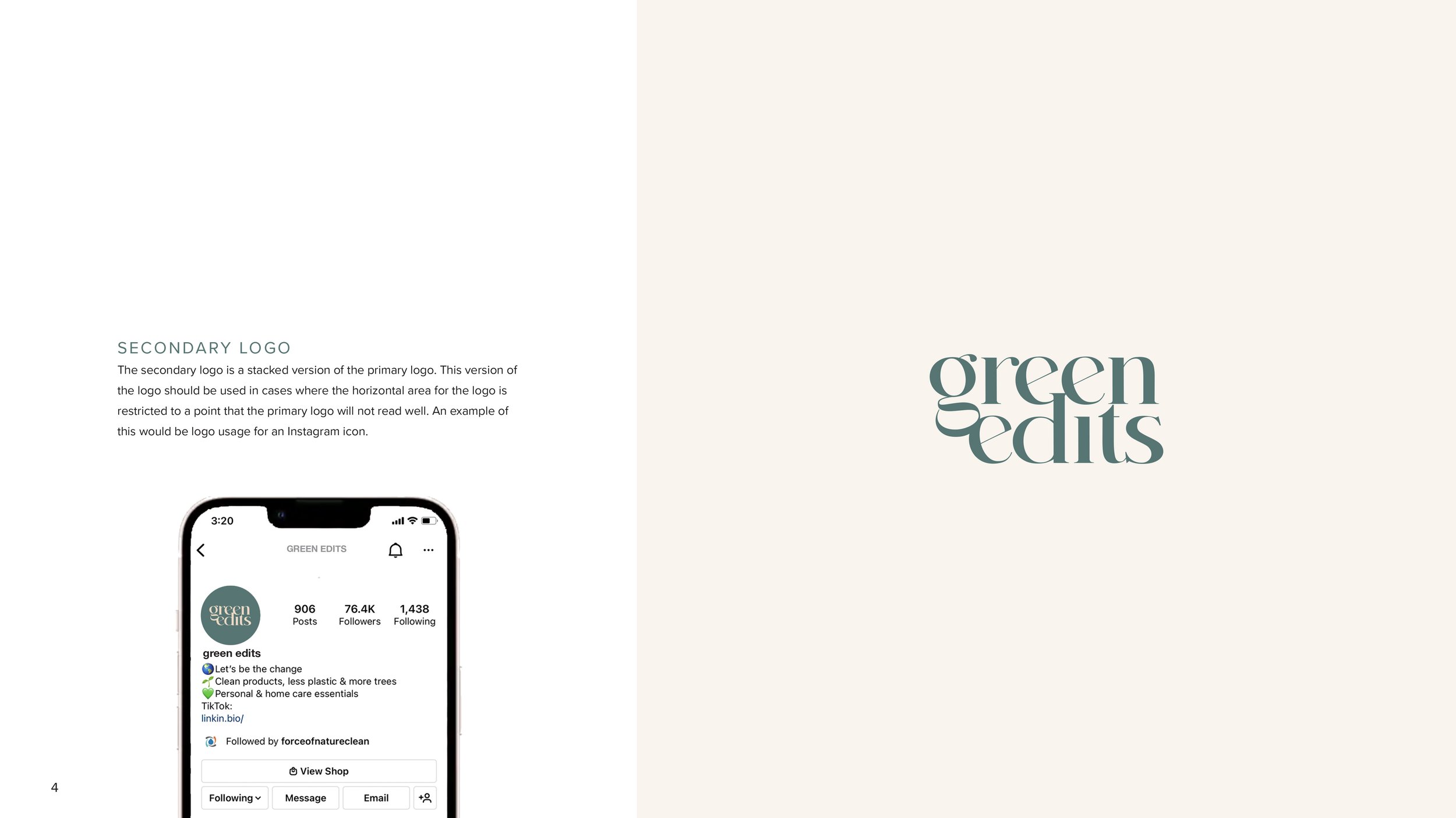
For the logotype I landed on using the font Kenoky Medium because of its unique rounded letterforms and high contrast. The all lowercase logotype is friendly while also aspirational, encapsulating the essence of the brand. A secondary stacked logo was also developed through manipulation of the typeface for compact applications.


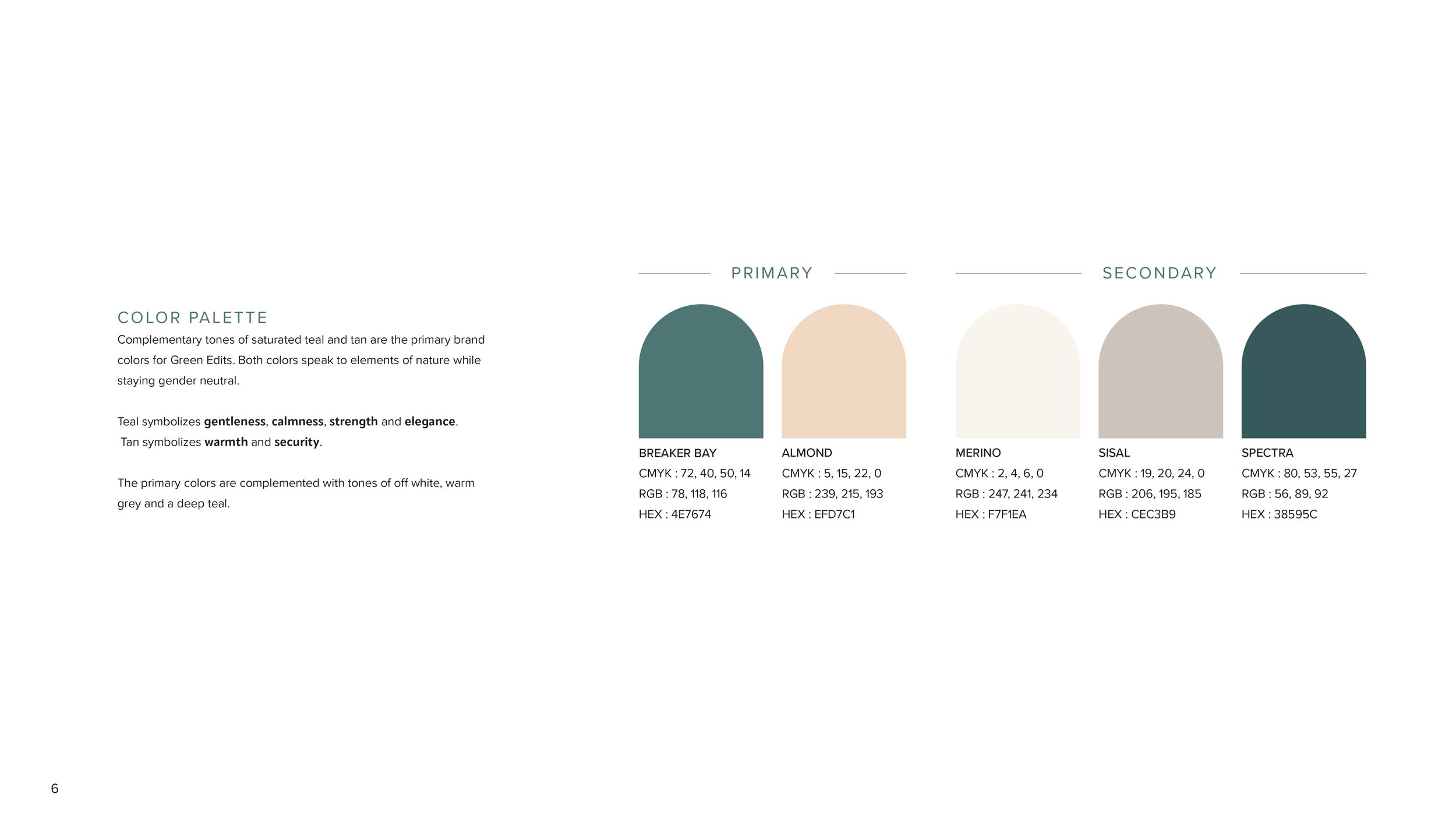
COLOR PALETTE & MOOD /


The primary color palette includes the complementary colors Breaker Bay, an understated teal, and Almond, a saturated tan. When these colors are paired with secondary colors of Merino, Sisal and Spectra the full palette becomes very versatile. This palette also plays well with the tones of products the brand plans to advertise.
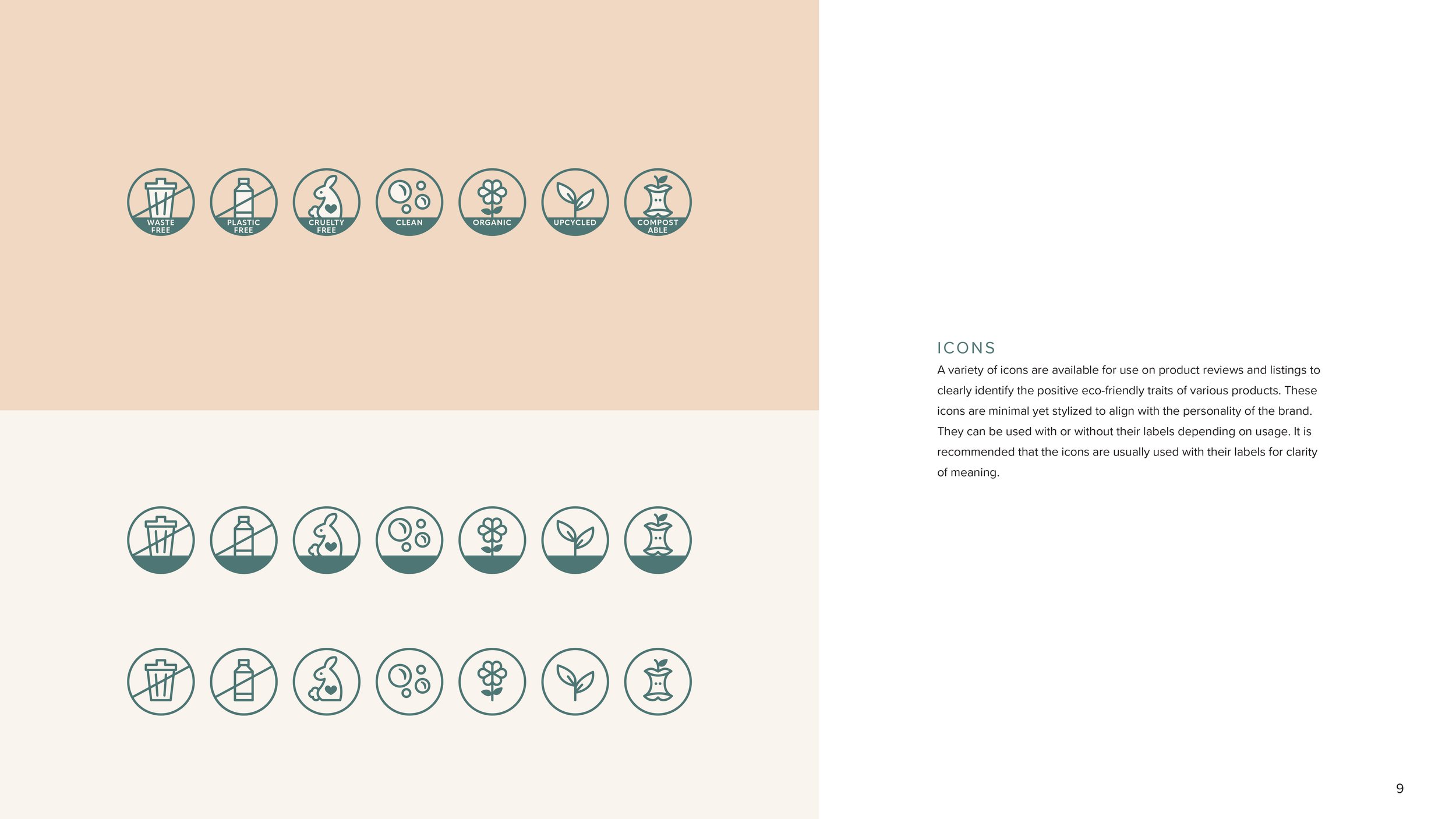
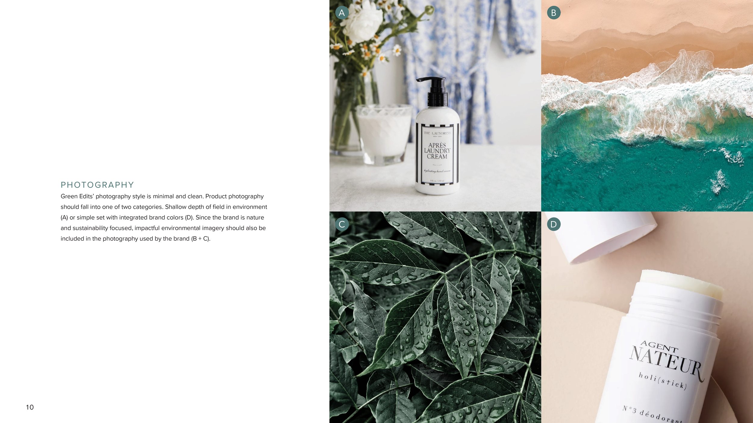
ICONS /

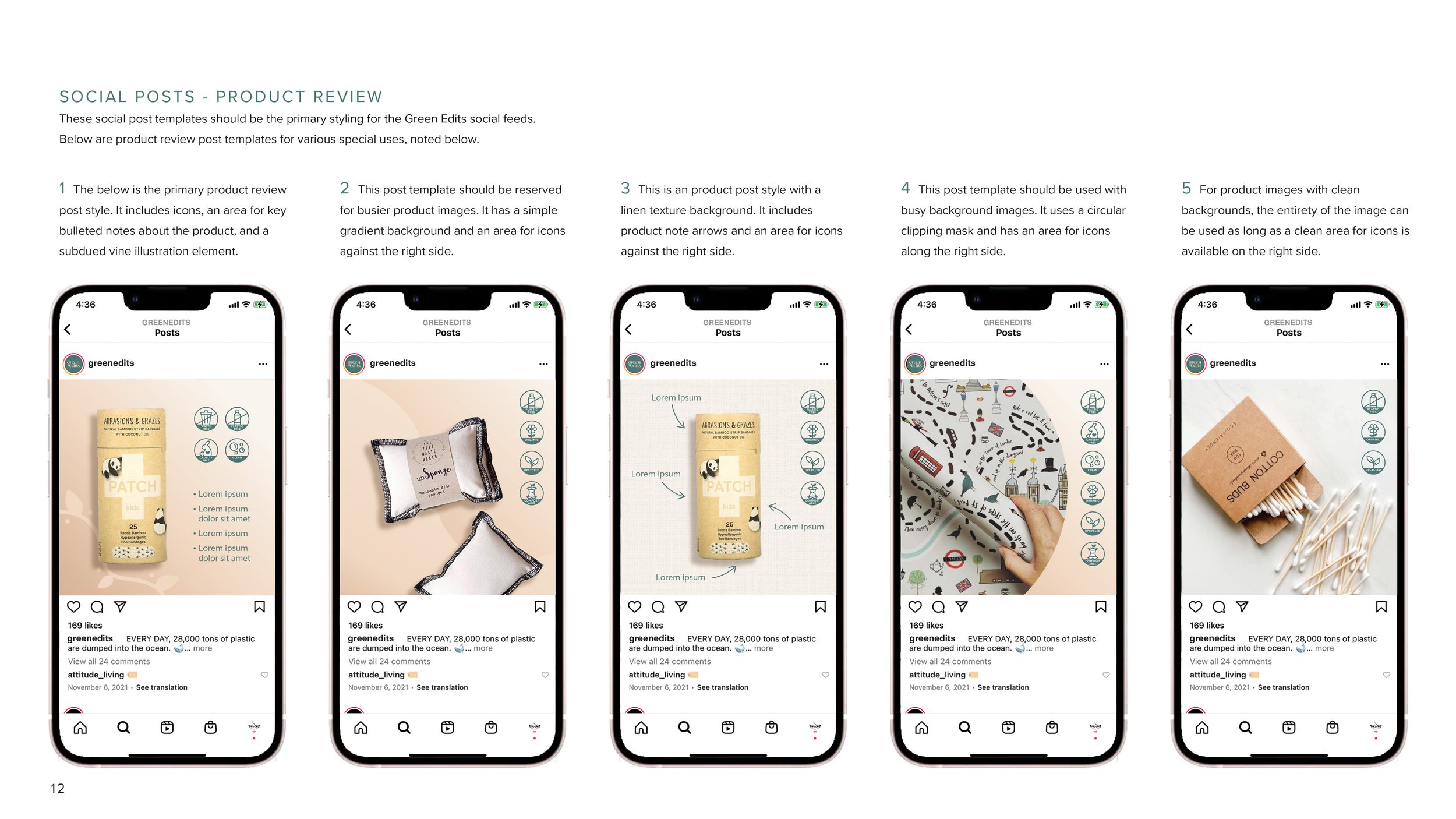
It was imperative to create a library of icons to be used across product reviews for Green Edits. This allows viewers to have a visual reference for the eco-conscious details of each product the brand carefully selects to advocate. The style is modern and minimal, able to be used in a variety of places either with or without a label.
Visual toolkit /


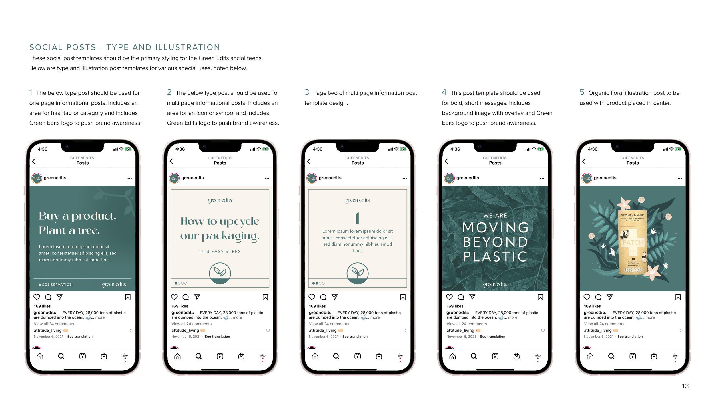
A variety of assets were designed for the visual toolkit. These designs cover a wide range of needs for the brand including product reviews, illustration posts and multiple message and communication styles.
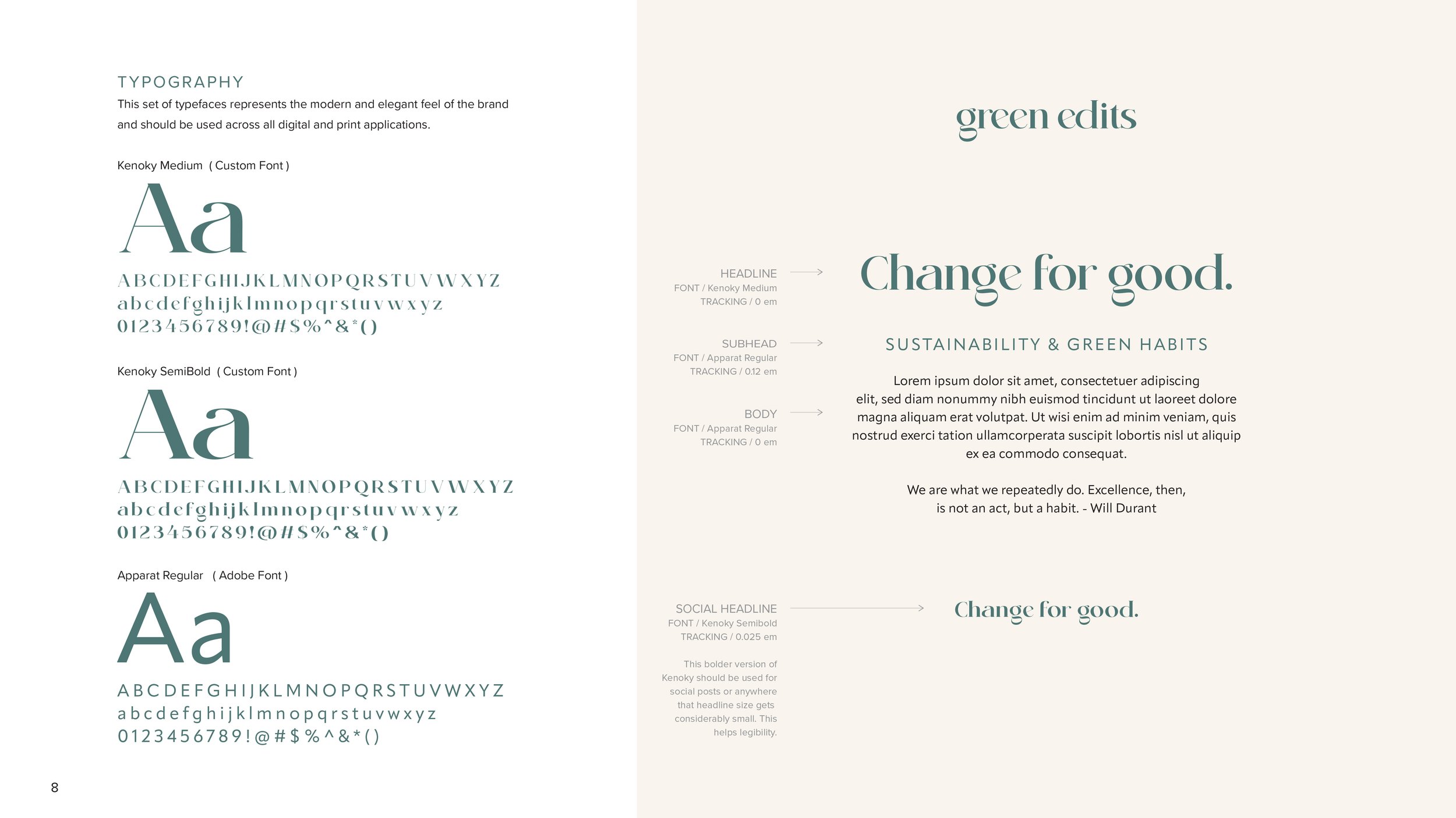
TYPOGRAPHY /

A type hierarchy was developed to be used throughout communications for the brand including Social Posts, Site Design and Direct To Consumer Messaging.
BRAND GUIDELINES /
Easy to follow brand guidelines were created to give clear instructions that allow all future assets to follow the established tone of the brand.